
- Image changed to 1 of 3
Plain bedding for an understated bedroom
Products
- Image changed to 1 of 7
- Image changed to 1 of 6
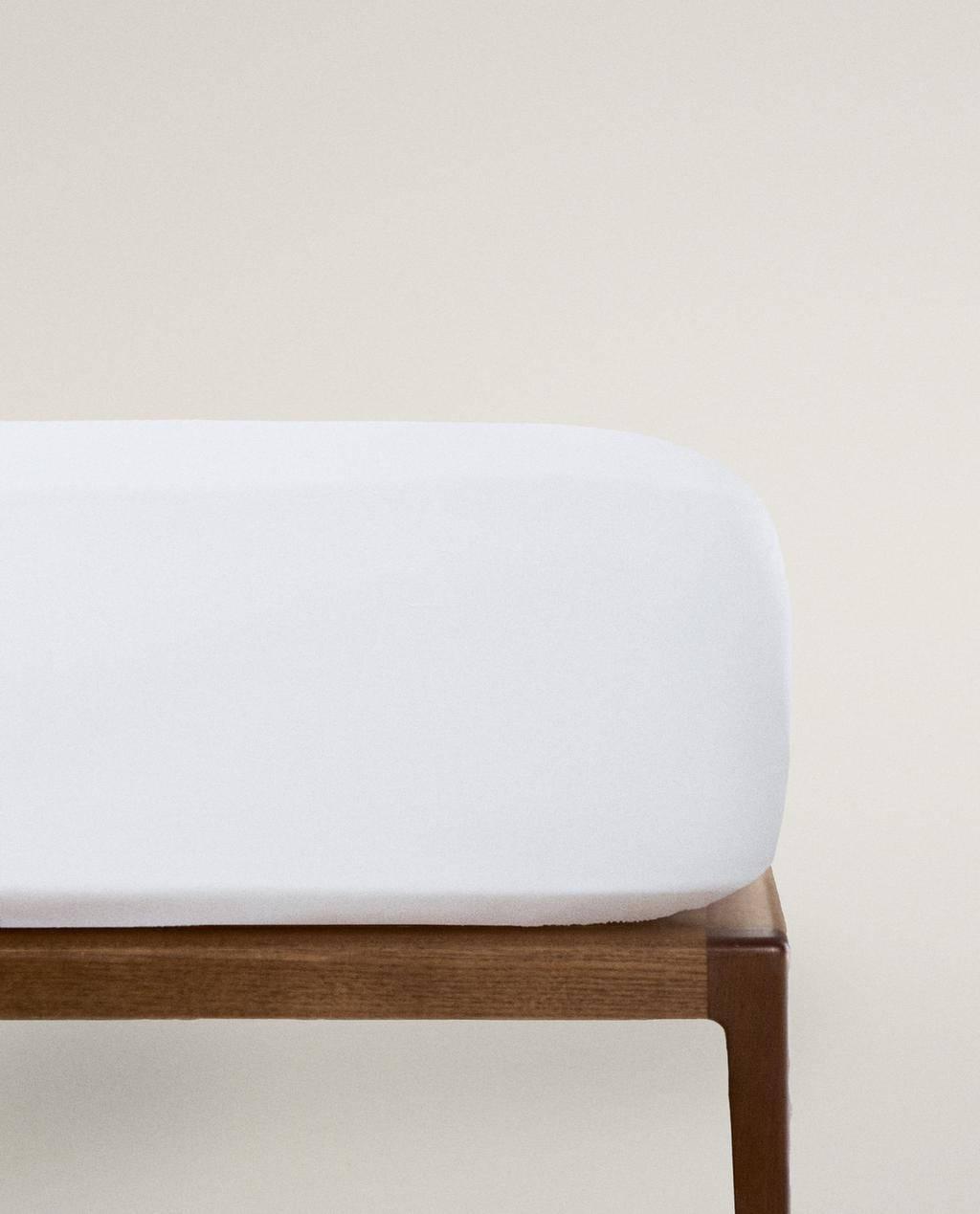
SUITABLE FOR 30 CM DEEP MATTRESSES
Current price ranges from ¥ 159 to ¥ 269- Image changed to 1 of 6
- Image changed to 1 of 7
- Image changed to 1 of 6
- Image changed to 1 of 6
- Image changed to 1 of 5
SUITABLE FOR 30 CM DEEP MATTRESSES
Current price ranges from ¥ 239 to ¥ 429- Image changed to 1 of 6
- Image changed to 1 of 6
- Image changed to 1 of 6
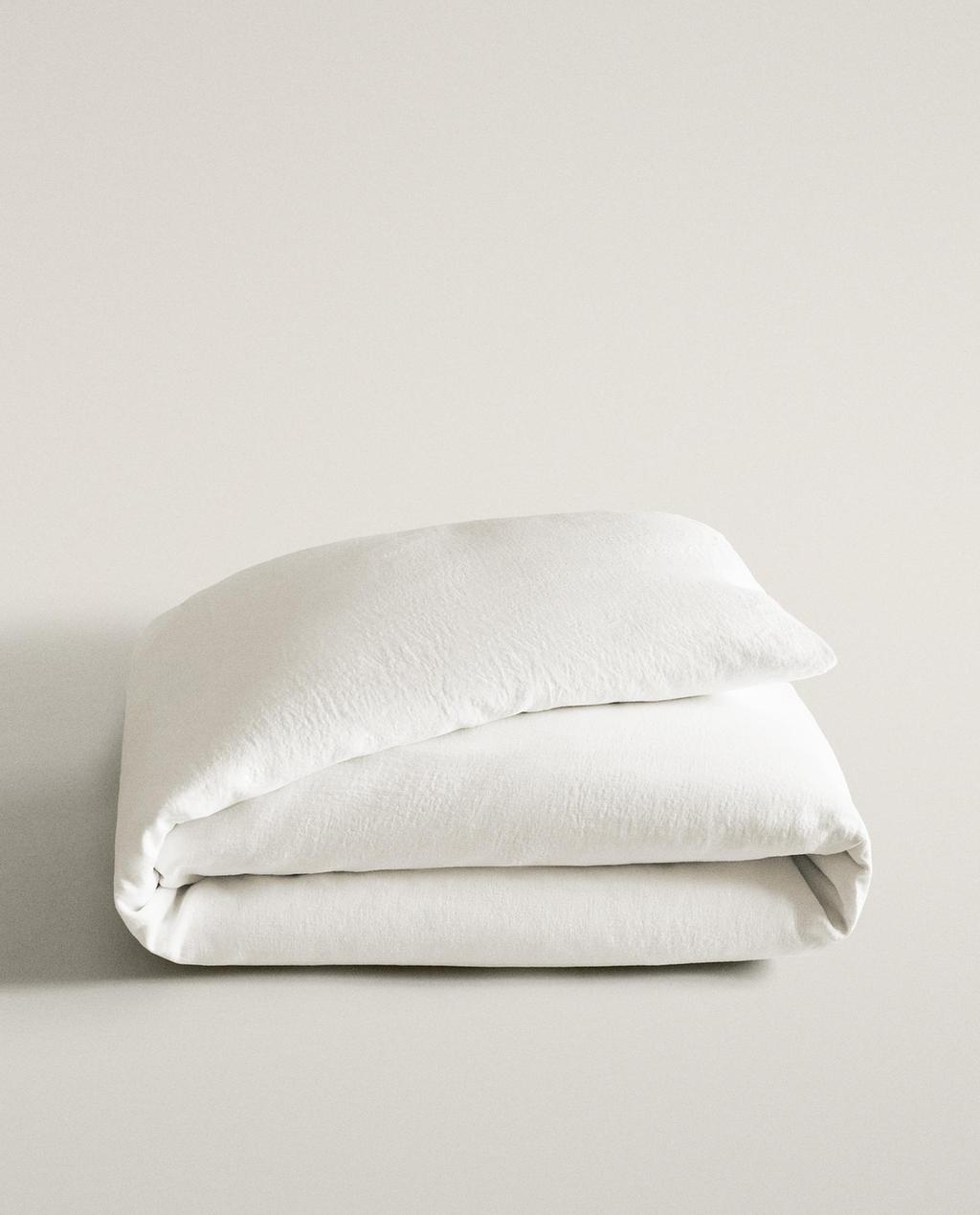
- Image changed to 1 of 6
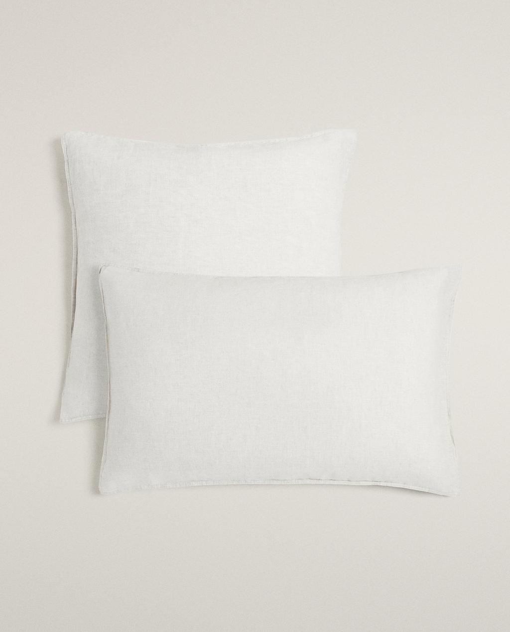
- Image changed to 1 of 7
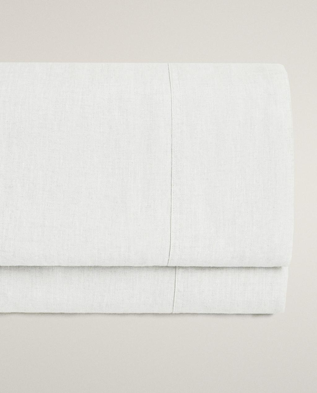
- Image changed to 1 of 6
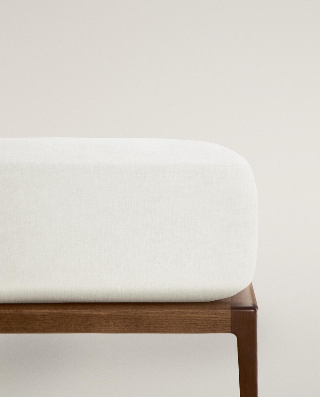
- Image changed to 1 of 6
- Image changed to 1 of 7
- Image changed to 1 of 6
SUITABLE FOR 30 CM DEEP MATTRESSES
Current price ranges from ¥ 839 to ¥ 979- Image changed to 1 of 5
- Image changed to 1 of 7
- Image changed to 1 of 6
- Image changed to 1 of 6
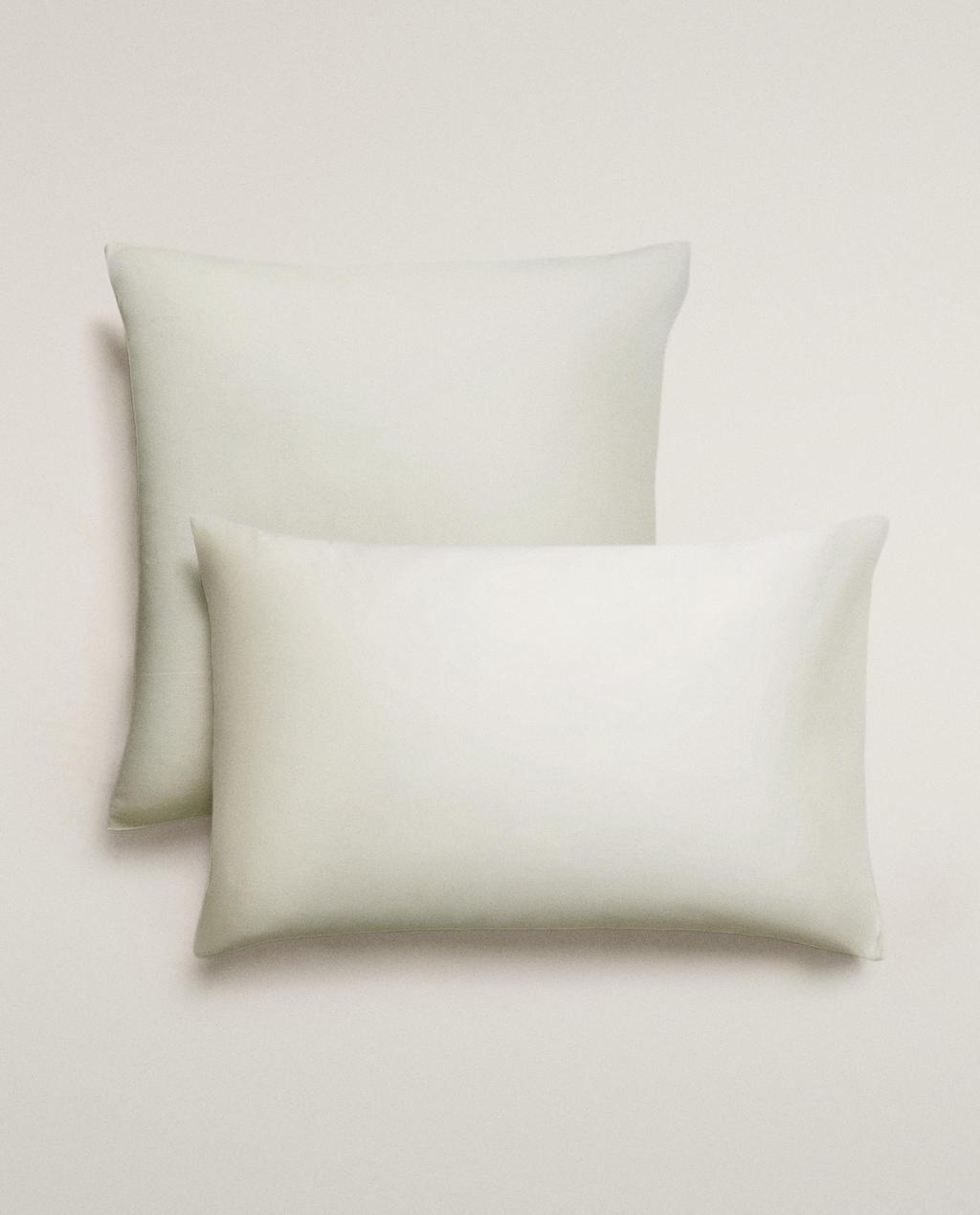
- Image changed to 1 of 5
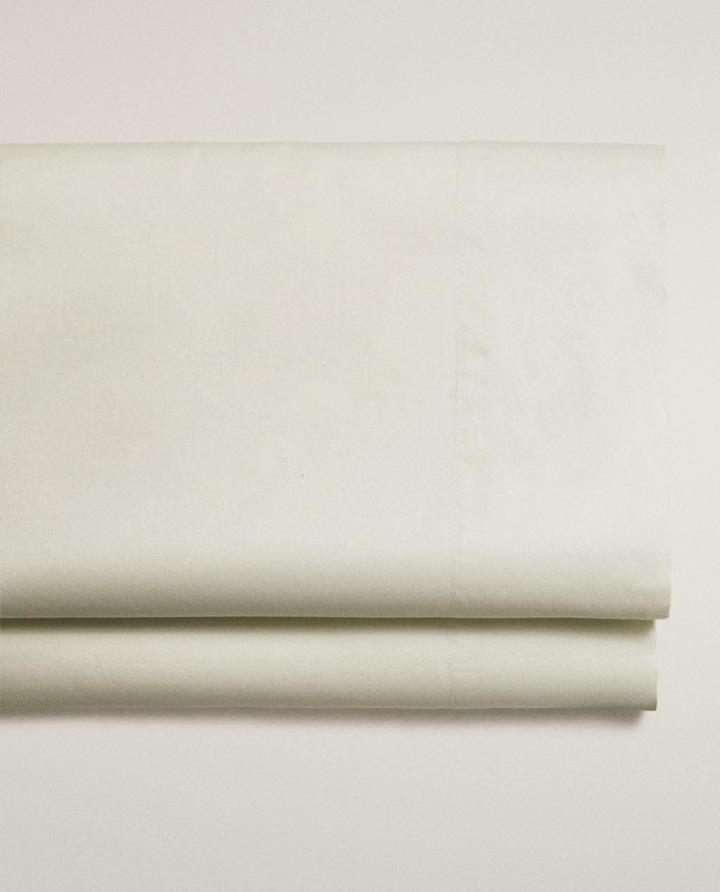
SUITABLE FOR 30 CM DEEP MATTRESSES
Current price ranges from ¥ 429 to ¥ 439- Image changed to 1 of 5
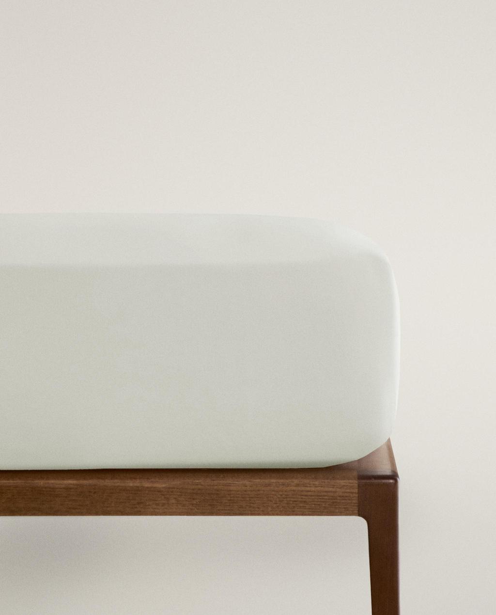
- Image changed to 1 of 6
- Image changed to 1 of 6
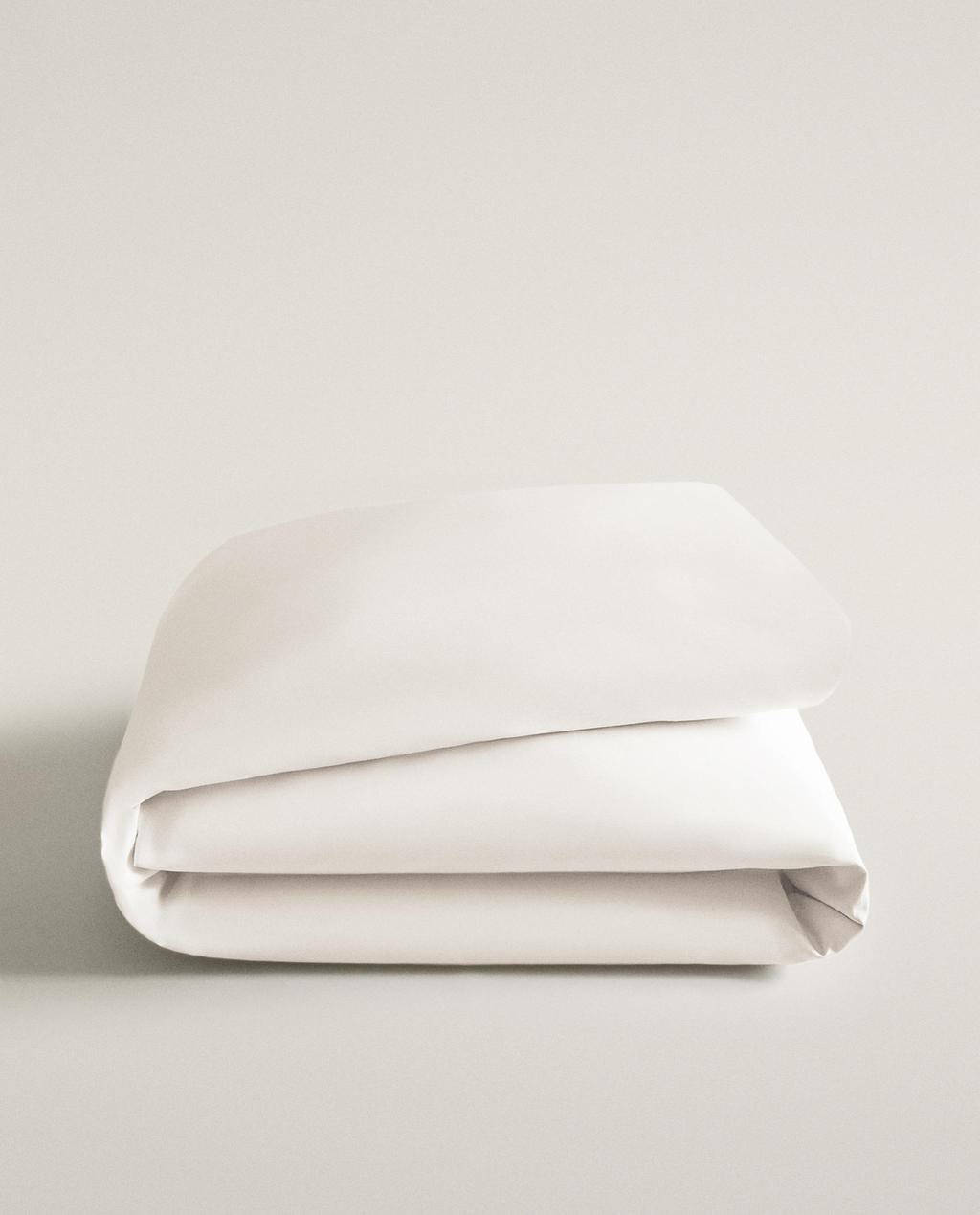
- Image changed to 1 of 6
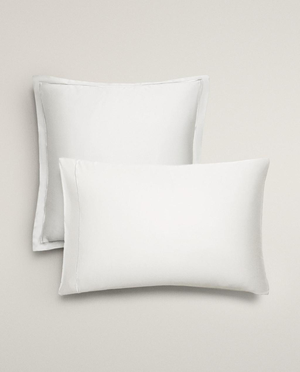
- Image changed to 1 of 5
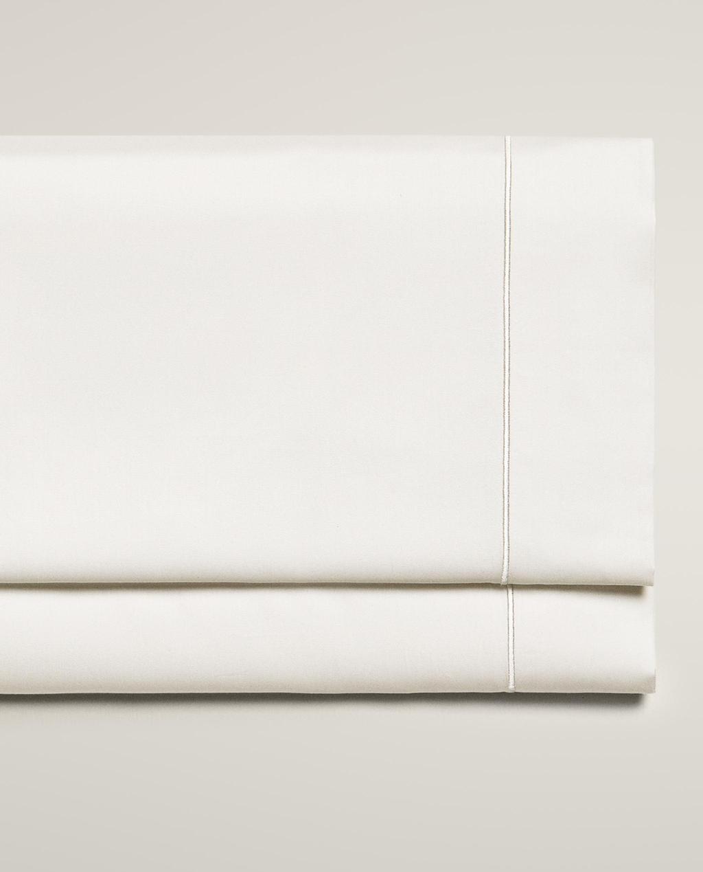
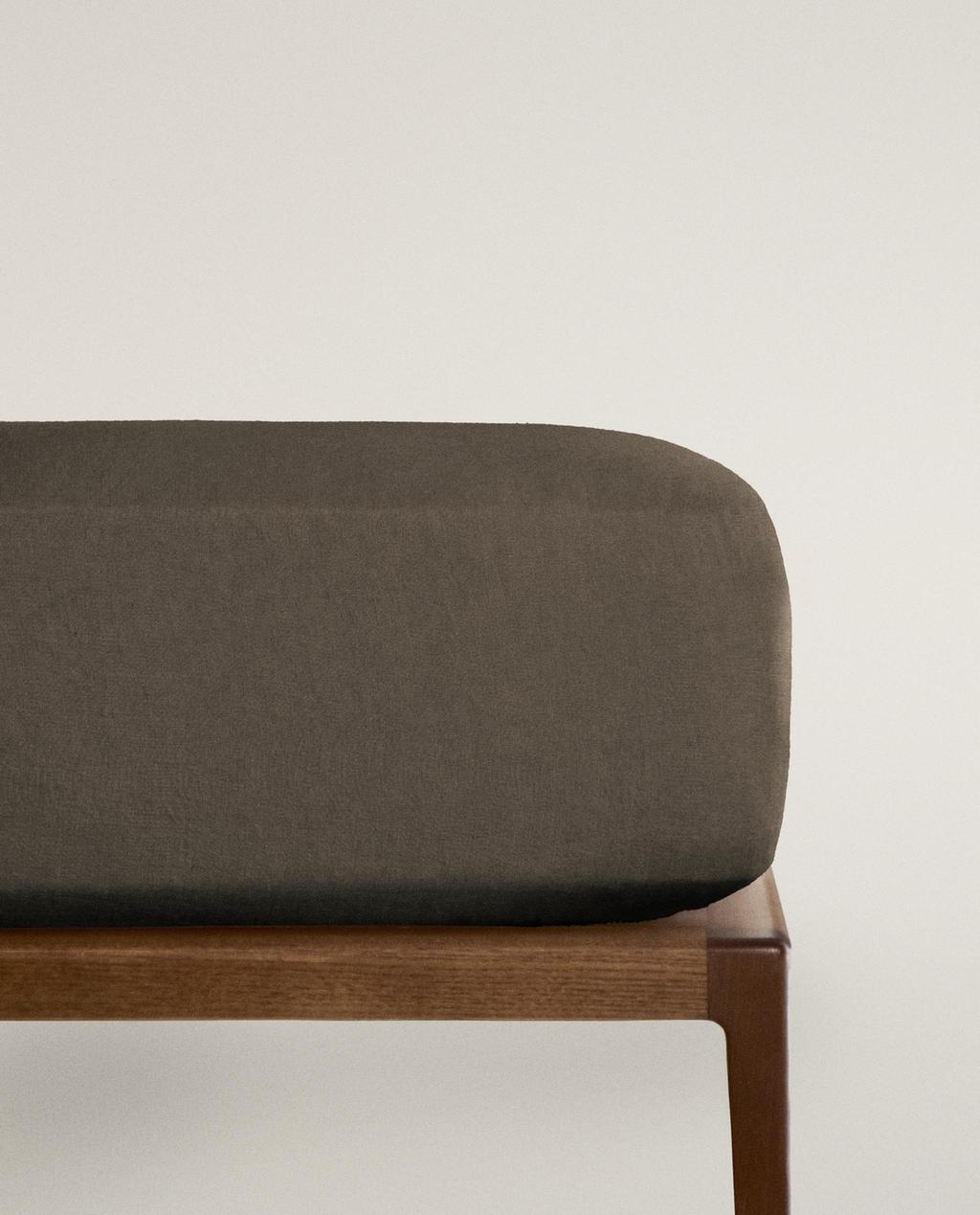
SUITABLE FOR 40 CM DEEP MATTRESSES
Coming Soon
Current price ranges from ¥ 269 to ¥ 439- Image changed to 1 of 7
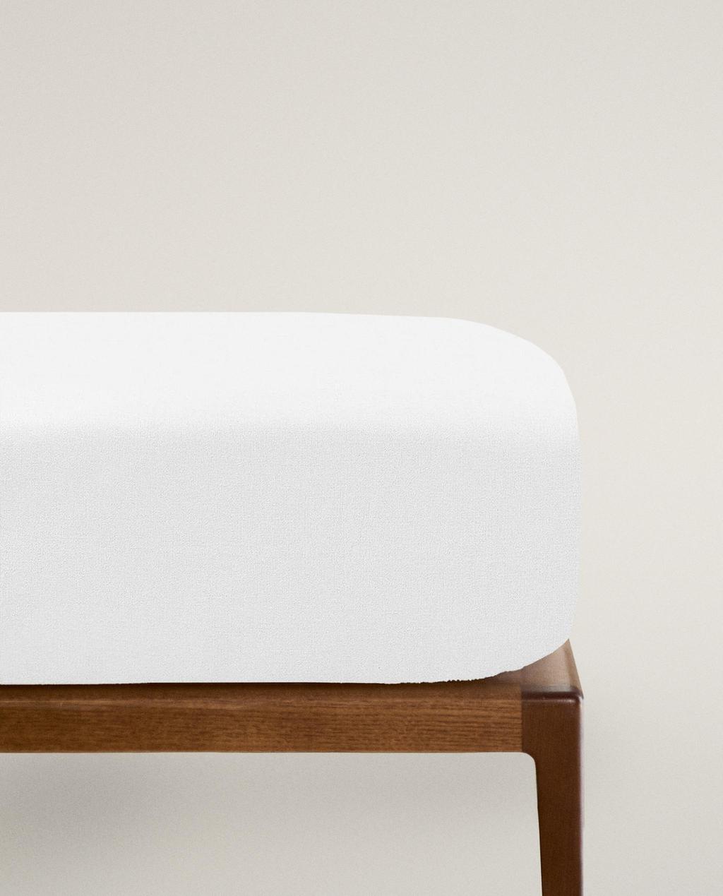
SUITABLE FOR 30 CM DEEP MATTRESSES
Current price ranges from ¥ 239 to ¥ 429- Image changed to 1 of 7
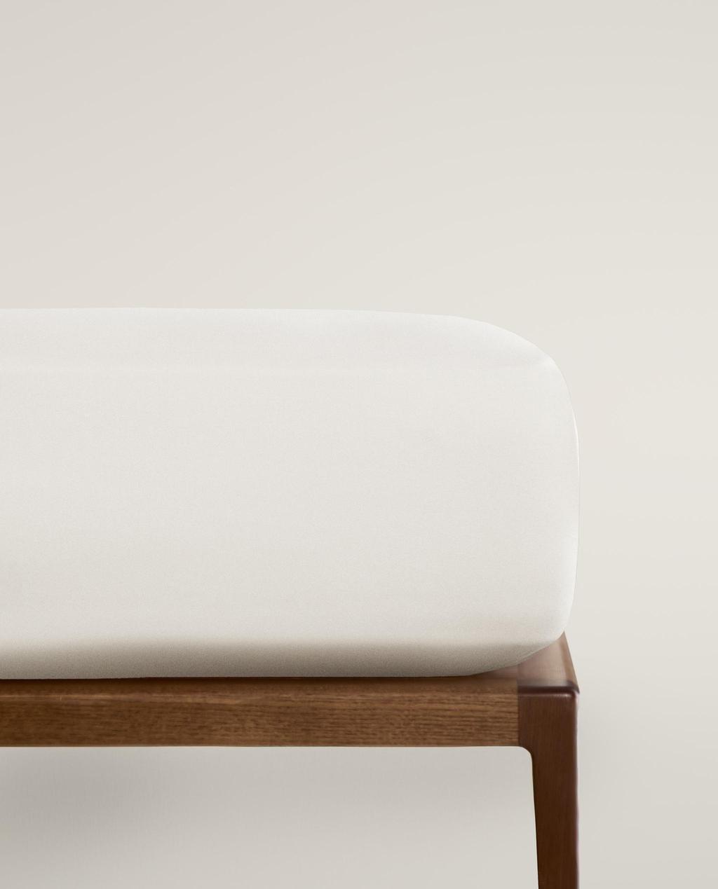
- Image changed to 1 of 6
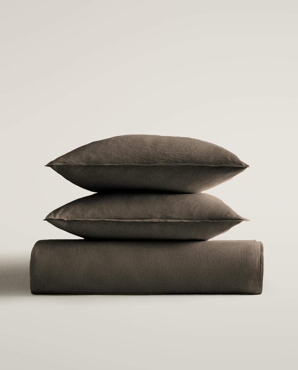
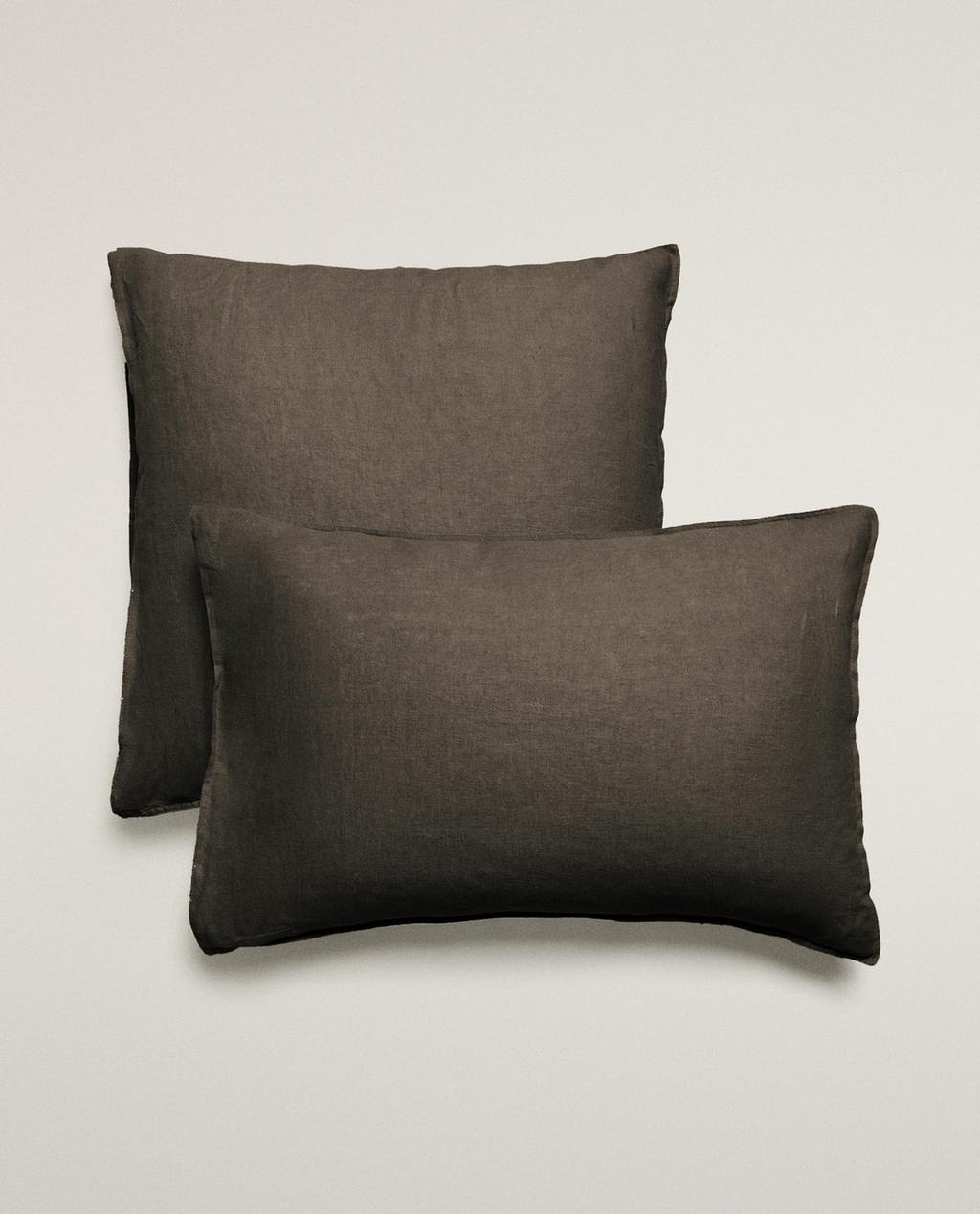
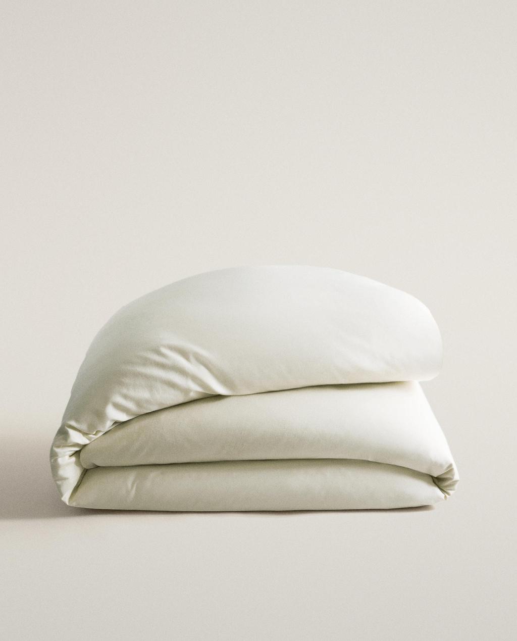
Plain bedding for an understated bedroom
Plain bedding from Zara Home lets fabric, texture and colour do the work without relying on bold prints. From warm neutrals to softer seasonal shades, these understated designs create an adaptable base that sits naturally with the wider bedding collection and gives the bedroom room to evolve around it.